Geologická fakulta

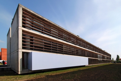
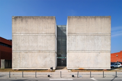
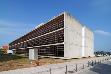
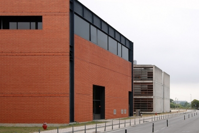
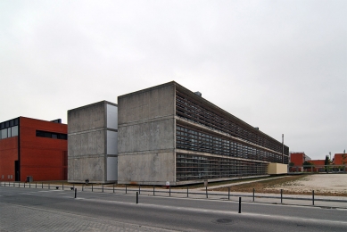
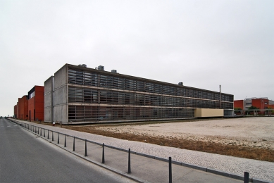
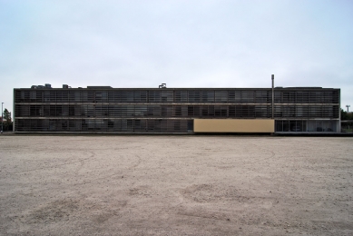
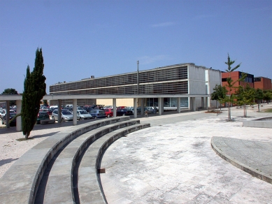
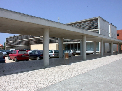
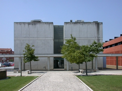
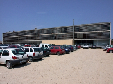
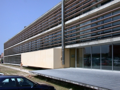
The urbanistic planning of the campus and the university´s conditions established clear premises: the total surface to be constructed should be of 46,138 sq.ft; the maximum height, three floors; the building´s length, 262 ft; the width, 66 ft; surface percentage for circulation purposes, approximately 20 %; material to finish the façades, red tile.
With such clear urbanistic instructions, who needs an architect,was probably the thought of Souto de Moura: «As the rules of the game were already established, the building took form almost without discussion: a box cut by a central corridor.»
One has only to look at the other campus buildings: linear tile blocks, all with three floors, standing parallel and equidistant; the only difference lies in the windows being long or square-shaped, and the shutters in light or dark shades.
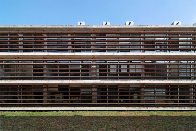
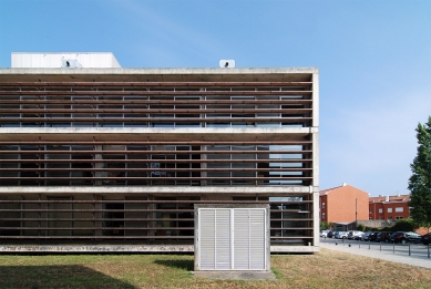
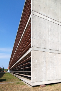
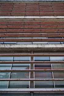
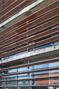
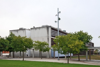
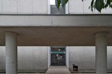
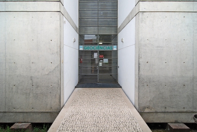
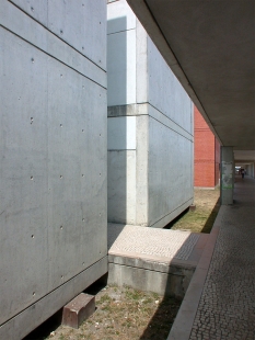
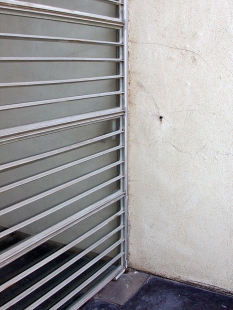
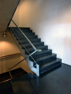
On the contrary, the building created by Souto de Moura transmits a great austerity, an evident refusal of all that is accessory in architecture, an enormous attention to detail with the intent of minimizing its repercussion in the final result, the desire not to disguise the structural elements so as to make evident the construction rules, and an effort to geometrically abstract the elements which form the buildings.
The rooms are spaces empty of accessories and where there is only the essential furniture.
The rooms are spaces empty of accessories and where there is only the essential furniture.
Francisco Asensio Cerver: Atlas de Arquitectura Actual
0 komentářů
přidat komentář


