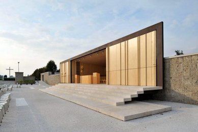
Square and open air altar

 |
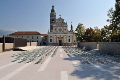
The pilgrimage church of St. Vid was built in the late 19th century. The square in front of the church is an essential part of the church complex, as this is where the public gathers on religious holidays for Mass and other open-air Catholic ceremonies. During the 20th century, several plans were developed for the square. One of those that was actually executed was the fine stone wall around the perimeter of the square, designed by Jože Plečnik in the 1930s.
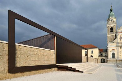
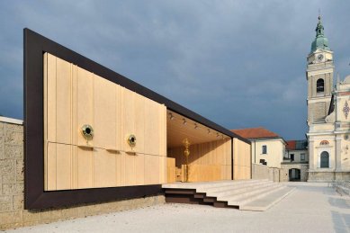
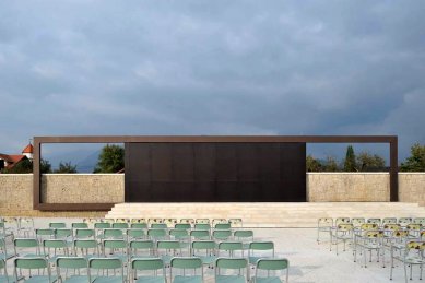
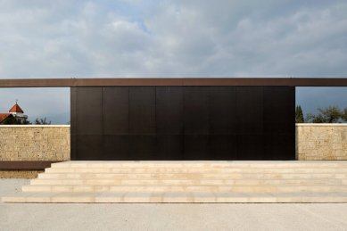
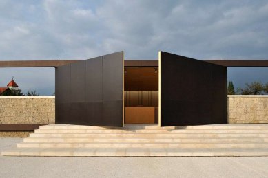
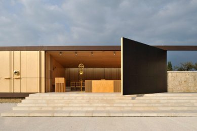
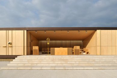
Maruša Zorec and her collaborator Martina Tepina decided to use this wall as a 'supporting' element for the new structures. Public toilets and other services were placed just behind the wall and thus elegantly screened from sight. And the altar, which for decades had stood right in front of the church facade, was also aligned with the wall; in fact it was inserted into it. This particular design decision has an impact on the entire complex. The church now enjoys an even more dominant position on the square and its colourful mosaics, designed in the 1960s by Ivan Vurnik, appear even more striking. The worshippers at the open-air ceremonies now sit closer to the altar and can establish a more intimate relationship with the event being staged. And, perhaps most importantly, as a result of this solution the square has become the central, unifying element of the entire complex.
It 'works' in two directions, connecting the church with the open landscape and connecting the altar with the park opposite which was, until now, visually disconnected from the rest. In other words, Zorec and Tepina's design ties all the elements of the complex together to create a new whole.
The altar itself is constructed of steel and concrete but its interior is entirely dressed in birch wood. Light enters from above but its source is invisible; all one sees are the magical effects on the wooden surfaces. This and the simple box-like form give this space a particularly Finnish feel and act as an excellent backdrop for the richly ornamented religious objects that embellish the walls and altar table. The gilded neo-baroque angels are right at home here. The square design is equally basic: it was meant to be entirely paved in stone but when this proved to be too expensive it was paved in concrete slabs. Only the stairs leading to the altar and those leading to the square itself are made from local stone. After some time, the two materials may acquire the same colour, and the square will become what it was meant to be – one continuous, unified surface.
Maruša Zorec emphasizes that this project could not have happened without such a good client, the priest Silvin Kranjc, who was as personally committed to the project as the two architects. He made sure that the design was properly executed and also defended it against criticism. For there has been some negative criticism, such as that the al ar structure is not sufficiently monumental or that it is too plain. But there has been a lot of praise as well, like an elderly woman who commented that she had been coming here all her life, but had never before realized just how stunningly beautiful the square actually is.
Petra Čeferin, A10 #24, 11-12/2008
4 comments
add comment
Subject
Author
Date
...
Daniel John
07.08.10 12:42
Plečnikova cena 2009
Petr Šmídek
07.08.10 08:24
neuveriteľné
ms
12.08.10 08:37
Krásné
Beata Lenarcik
13.08.10 02:50
show all comments


