Museum Brandhorst

 |
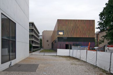
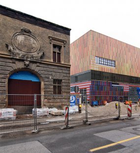
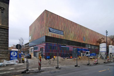
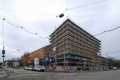
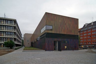
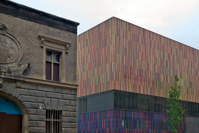
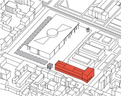
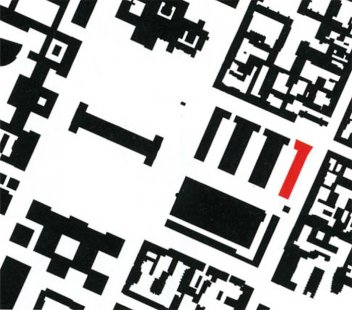
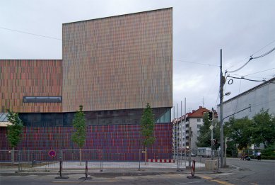
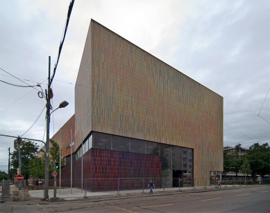
The new building adopts the urban concept of the Pinakothek der Moderne, the second phase of which consists of a 17m high wing to fill in the city block along Gabelsbergerstrasse and Tuerkenstrasse, as the historical Tuerkenkaserne once did. The museum continues this building line along Tuerkenstrasse. The corner at Theresienstrasse is marked by increasing the height of the building. As the building façade is set back eight meters further than the original historical buildings to accommodate a row of trees, the head of the building angles out toward the street intersection to define the space here more firmly. The height of the corner element matches that of the apartment building on the opposite side of the street, designed by Sep Ruf, an icon of post war architecture.
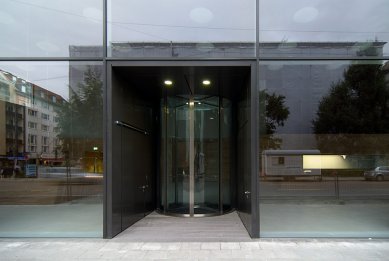
By locating the entrance to the Museum at the intersection of Tuerkenstrasse and Theresienstrasse, a symmetry with the southern entrance of the Pinakothek der Moderne at the corner of Tuerkenstrasse and Gabelsbergerstrasse is created, which opens up a connection between the Museum Quarter and the adjacent neighbourhood of Schwabing.
Building
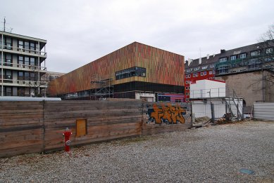
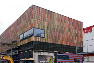
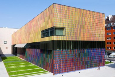
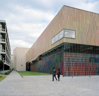
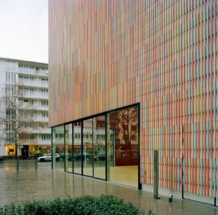
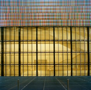
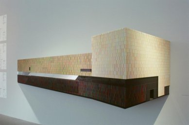
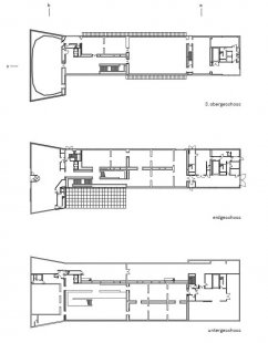
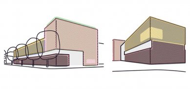
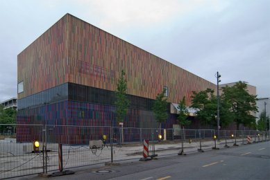
The parts of the museum that are visible above ground consist of a longitudinal building (l=98m, w=18m, h=17m) and a main entrance building (l=34m, w=17m, h=23m). These volumes are connected by a continuous strip window that divides the building visually into two floors. On the “head” at Theresienstrasse, this band flows into the generous glazing of the main entrance. Here, a smaller area of glazing opens the foyer café toward the north and west; additional individual windows provide composed views into and out of the building.
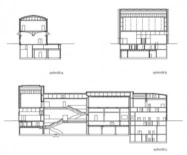
The ground treatment and landscaping to the west reveals the extent of the building underground (w=27m, l=97m, t=15m). The building has three exhibition levels with average floor heights of 9 meters. To the south, the administration and depots are accommodated on eight stacked floors of 3.90 meters each. In addition to the exhibition areas, foyer, cafe, bookshop, seminar rooms and their ancillary rooms, the building contains rooms for administration and security personnel, a loading bay for art, exhibition workshops, restoration studios and depots. The complex heating, ventilation and air conditioning systems are housed primarily in a continuous subterranean technical area (l=98m, w=8m, h=8m) along the eastern side of the building.
Galleries
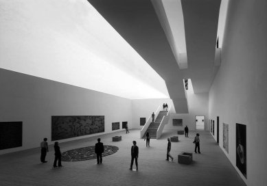
The museum’s exhibition spaces are spread over three levels. The galleries differ in size, layout and proportion from floor to floor, as well as in their specific natural and artificial lighting configurations. Located on the top level – with skylights directly above in the roof – there are rooms up to 450m² large with walls that allow artworks up to 9m tall to be hung. These rooms are fitted with continuous translucent fabric ceilings that uniformly distribute daylight, yet subtly convey the changes caused by the play of clouds and the sun’s position at different times. The room situated above the foyer, has been specially designed for Cy Twombly’s famed Lepanto Cycle. The twelve large-format paintings are hung panorama-style on a polygonal wall.
Located on the ground level are more intimate spaces, ranging in size from 55m² to 100m², with hanging heights of 5.50m. They are connected with each other linearly, but offset in such a way that new art works keep coming into view as one passes through them. These spaces are illuminated using a system of reflectors that direct daylight in through toplights in the side walls. The internal ceilings consist of textile-covered louvres that soften and scatter the light, while permitting the space and structure above them to be appreciated. The transverse gallery, approximately 7m high, is lit differently, by a large window at the side.
This provides ideal conditions for sculptures and three-dimensional objects, as well as creating a direct visual contact with the street. The central patio, 460m² large and 7m high, is located underground and lit directly from above. Six small galleries (each 65 m²) for photography and works on paper, opening off it at the sides, are illuminated solely with artificial lighting, which, in conformity with conservation requirements, is strongly reduced.
The media suite (approx. 240m²) for video and electronic art is conceived completely as a ‘black box’. In the patio, the structural elements of the roof and the lighting controls on the ceiling remain visible, giving it a loft-style technical ambience. The ceiling in the media area serves likewise as a technical stage. All of the galleries (with exception of the media suite) are finished with white walls and solid parquet flooring of Danish oak. This provides an unobtrusive backdrop for the works of art, which are predominantly hung on the walls. The use of lighting, colour and materials in the galleries lends them a naturally light atmosphere. Their architecture gives the art plenty of space to breathe. At the same time, they vary the interior in such a multitude ways that, in analogy to an art collection, we could speak of a collection of spaces.
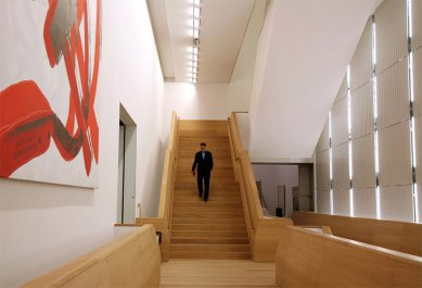
The three exhibition levels are connected by an imposing stair, clad with oak, which invites visitors to explore the various levels. Naturally, there are also two lifts to provide barrier-free access to the entire museum.
Light
The concept for this museum strives not only, as is usual, to illuminate the top fl oor with natural light, but the lower fl oors too. Below ground, this is achieved by offsetting the floor plan, which makes direct illumination from above possible. On the ground floor, a system of refl ectors direct light from the zenith through an asymmetrically arranged strip of windows into the galleries, providing uniform illumination.
In all of the exhibition spaces, bright daylight (up to 100,000 Lux in summer) is fi ltered through light-blades and reduced to gallery strength (approx. 300 Lux). Daylight ceilings of translucent fabric provide uniform distribution of natural light and reduce any strong variations in light levels. Additionally, artificial light sources have been installed above the day-light ceilings which, when needed, can be used to supplement or replace natural daylight. Calculations indicate that pure daylight (depending on the fl oor level) can be used for between 50%-75% of the museum’s normal opening hours. This not only creates
an outstanding quality of light for the art, but also leads to significant savings in the museum’s operating costs.
Energy
Stringent requirements for temperature stability, relative humidity and air quality in the exhibition spaces and depots constructed to international standards necessitate a high concentration of technical installations and result in enormous operating expenses. To minimize this expenditure, a completely new strategy has been developed by, and in cooperation with, the mechanical systems planners that permits savings of 50% of thermal energy and 26% of electrical energy, in comparison with similar buildings with conventional systems. As a result, associated CO²- emissions should be reduced by 356 tonnes per year. Expressed in absolute costs, this means yearly savings of 70,000€.
The primary source of heat energy for the building is an up-to-date groundwater heat pump – a solution that is favoured by the high groundwater temperatures in this quarter of Munich. This not only exploits an existing and free energy source, but also helps to restore the thermal equilibrium of the groundwater at this location.
Furthermore, in addition to conventional ambient air systems, the museum is heated and cooled by making active use of structural elements. A system of water pipes laid approx. 10cm below the surface allows all of the floors and most of the walls of the museum to be activated. The system directly heats or cools the walls or floors, which in turn exchange heat with the rooms and thereby create stable climatic conditions for the art on display. Consequently, the volume of air circulated to cool or heat the rooms can be almost halved in comparison to conventional air handling systems. The room temperatures remain signifi cantly more stable, especially in cases when there is a temporary failure of the technical systems.
Façade
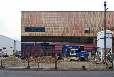
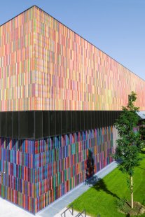
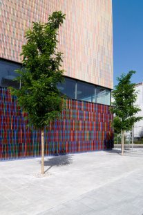
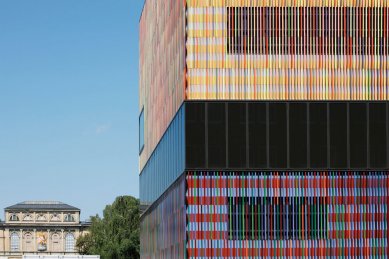
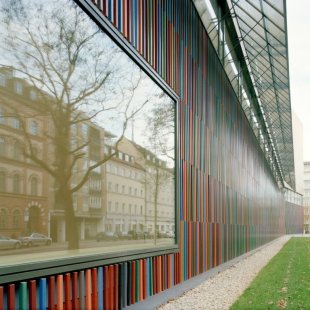
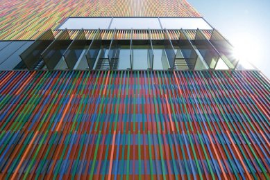
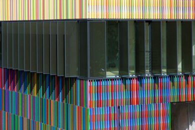
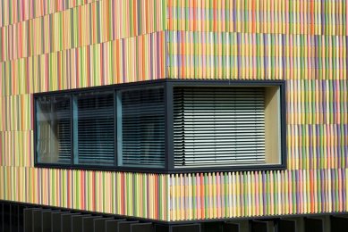
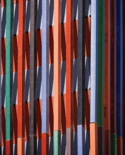
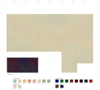
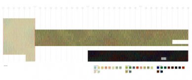
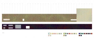
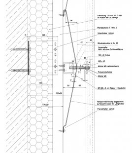
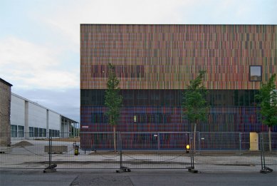
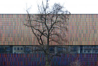
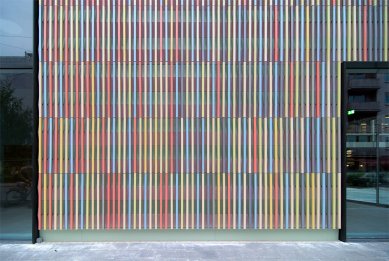
Whereas the main aim inside the museum is to create ideal display conditions, the exterior is intended to direct attention to its role as a repository of lively art. The polychromatic facade appears similar to a large, abstract painting. The exterior skin is constructed of several layers. In front of the substructure and the thermal installation, there is a horizontally folded bi-coloured sheet-metal skin with fine perforations that absorb the noise of traffic from Tuerkenstrasse and Theresienstrasse. In front of this horizontally emphasized element of the façade are 36,000 separate ceramic rods (4cm x 4cm x 110cm), attached vertically and glazed in 23 different colours. The rods, in three families of differing colour mix and tone (light-medium-dark), have been arranged in three areas in such a way that the building appears to consist of three interlocking individual volumes.
At the scale of the façade as a whole, the layering of horizontal and vertical lines along with the contrast and merging of colours create a general impression of oscillation in the closed exterior walls of the building – almost of dematerialisation – because the visible surface of the building alters as the observer moves. Between an angled view, in which the ceramic rods merge visually into a solid plane, and the frontal view, in which the mineral layer parts to let the horizontally striated background become visible and dominant, countless visual variations of materiality and structure are possible. Seen from afar, the three colour groups coalesce to form a neutral colour with respectively differing brightness and tone. Seen from close to, each of these fields resolve into its individual colours.
Sauerbruch Hutton architects
0 comments
add comment


